The problem
Pain points
Online poker brand, Partypoker launched a total overhaul in mid 2013. With a more mature, contemporary feel and revised colour palette, such factors needed to trancend throughout. The main problem with the old brand, it conveyed a fun factor yet overall, lacked any real brand concistency or style. Moreover, the a key pain point simply remained with being restricted to the use of generic stock imagery which always comes with creative limitations.
01
Design Thinking
Stepping up
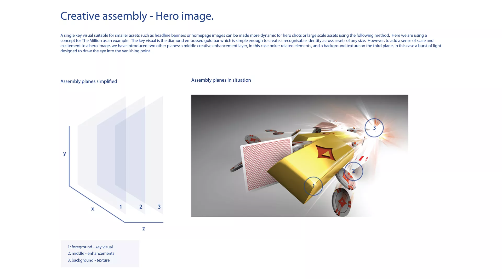
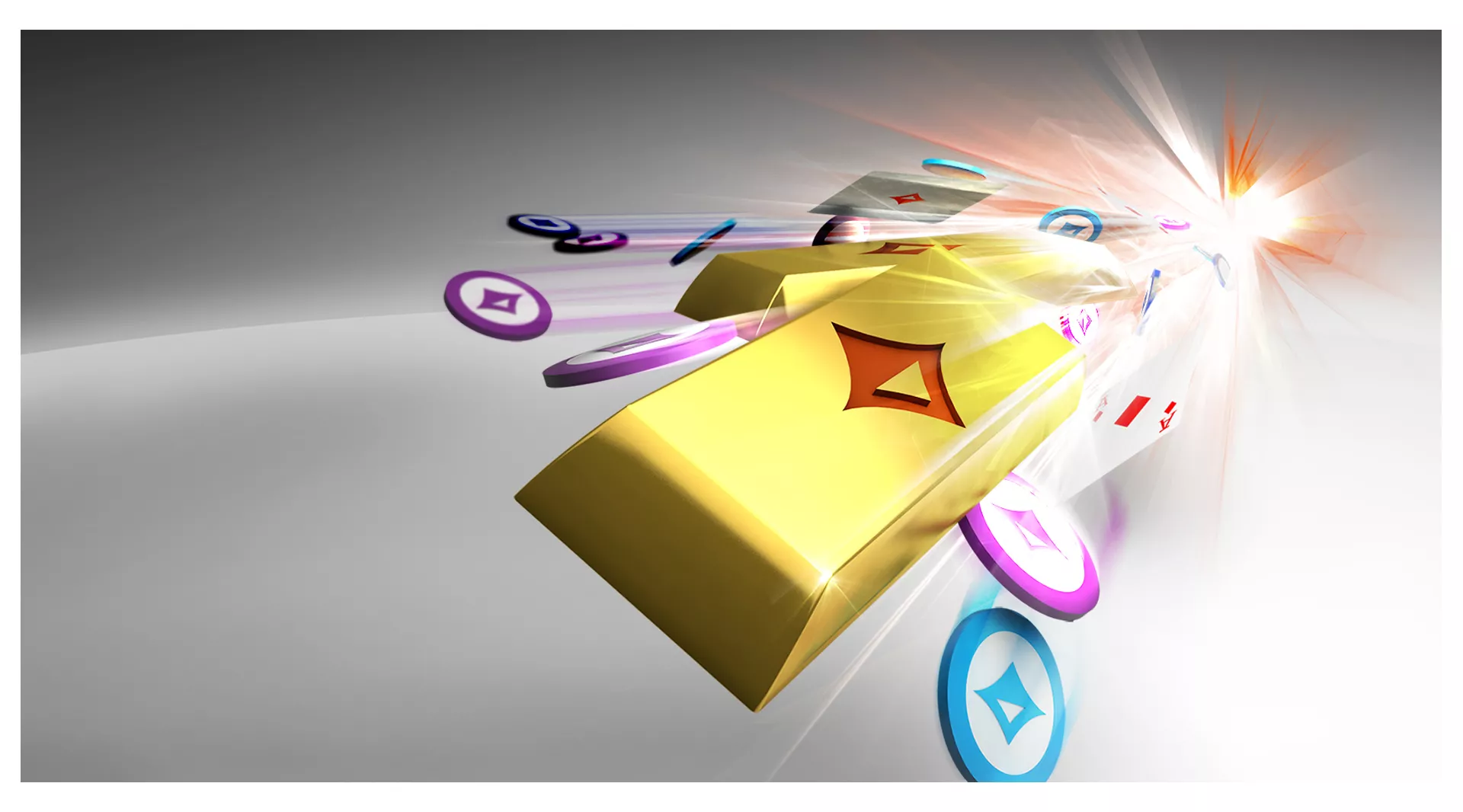
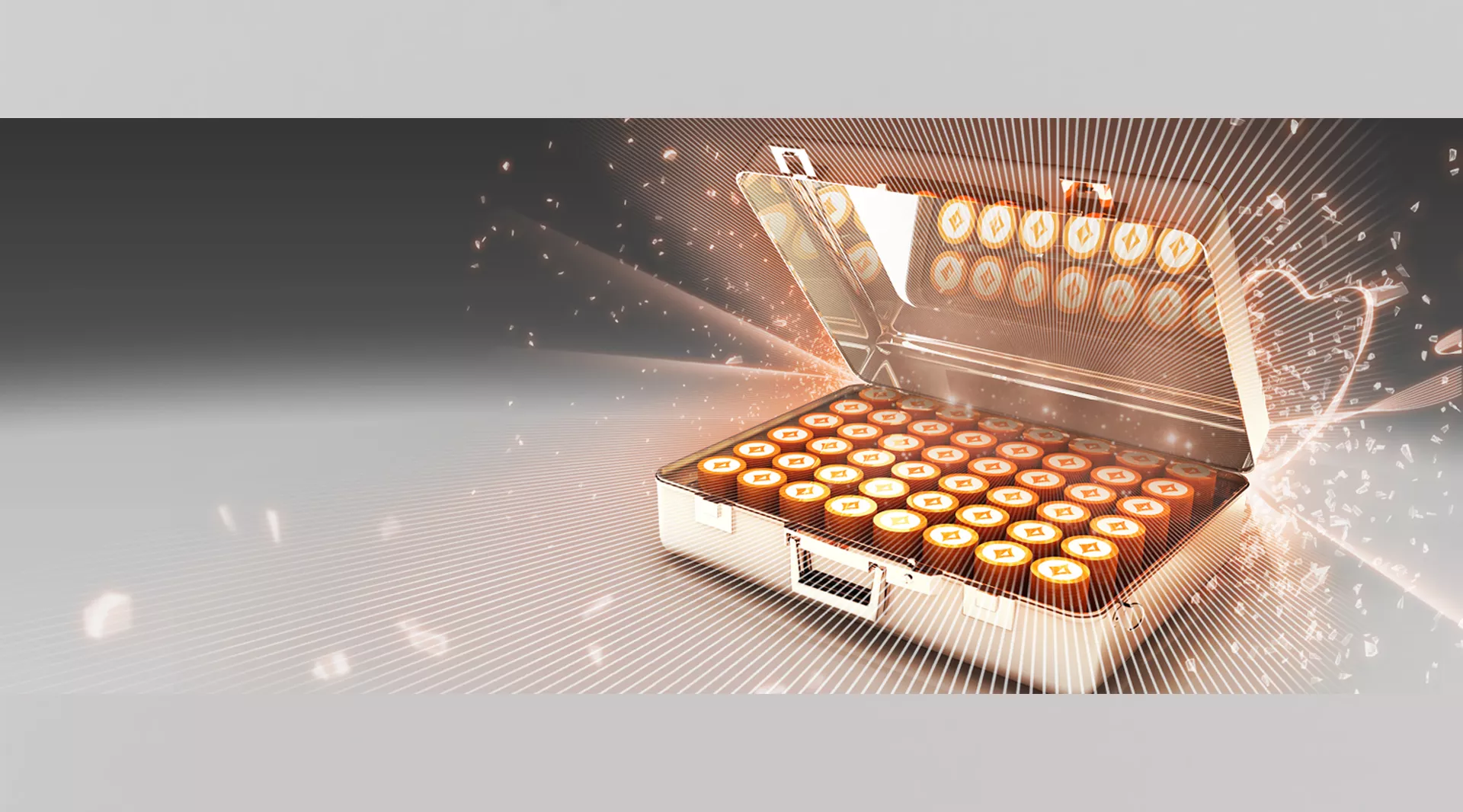
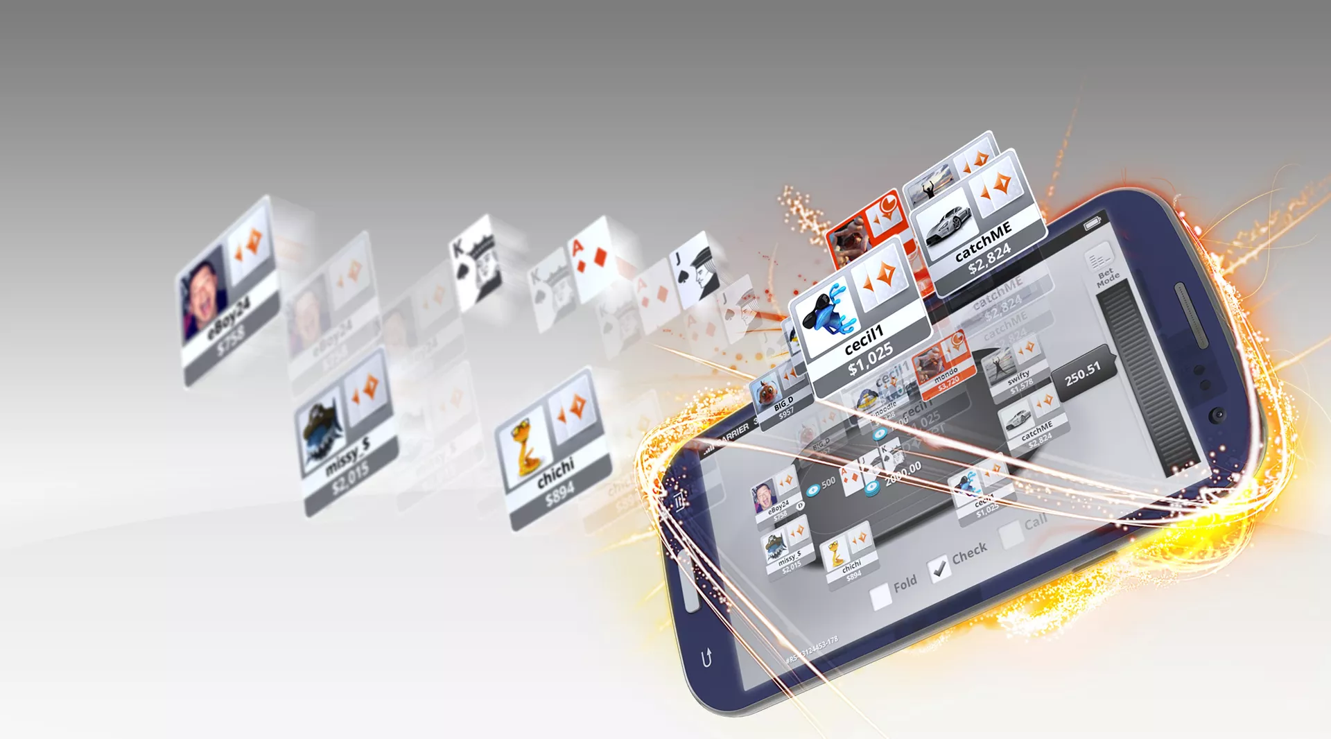
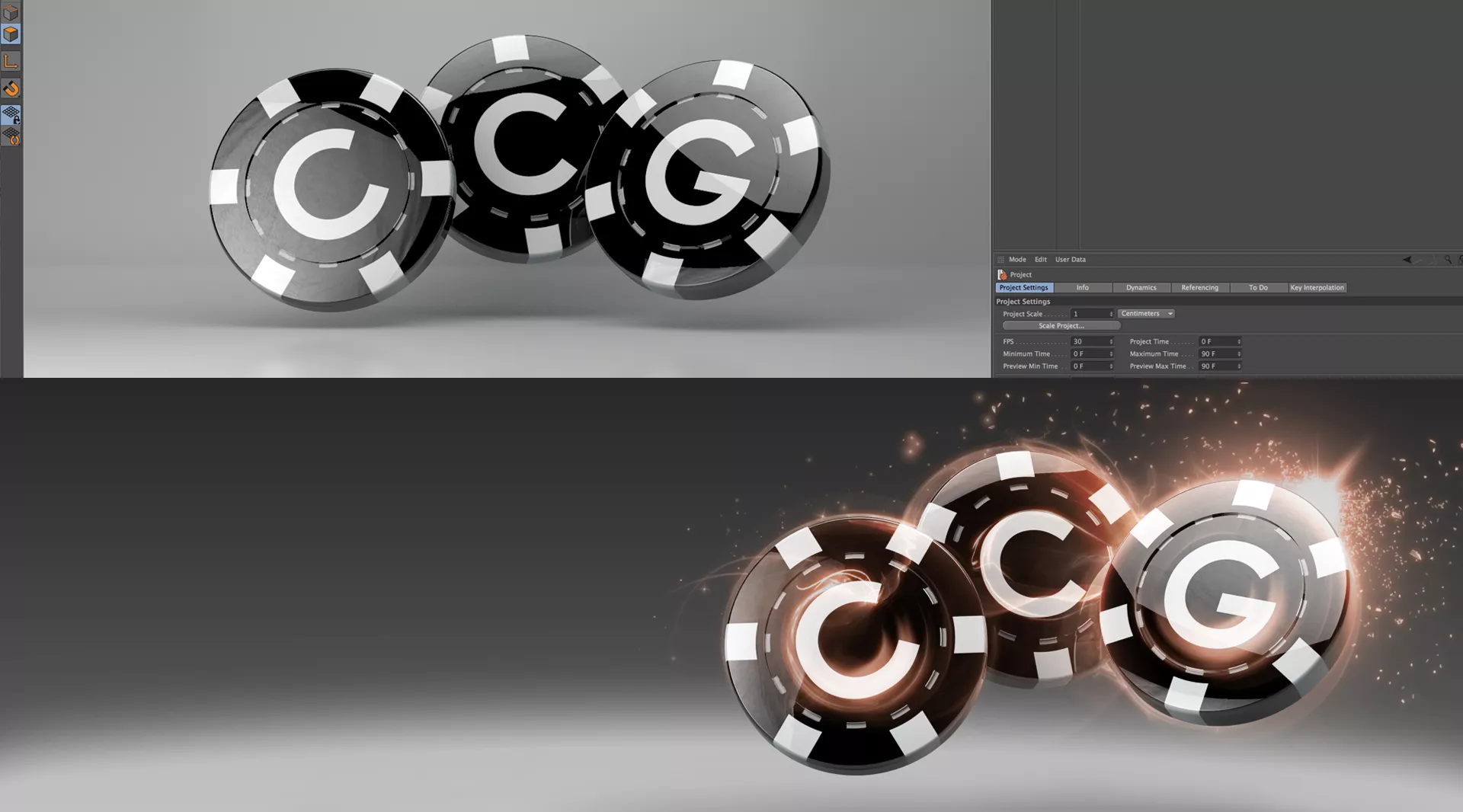
To prepare and align for the rebrand, creative pain points were highlighted and needed addressing. I proposed that we explored and utilised the power of Cinema 4D. Yes, this software was relatively new (at the time) and we had no real experts within the team. We embrached the opportunity to learn, discover and maximise the world of 3D. Ultimately, this would enable us to move away from the restrictions of generic stock imagery while having the power to not only control our own environment but to set the tone by creating a distinct brand style to set us apart from the market and compeitors.
The Solution
Foundation
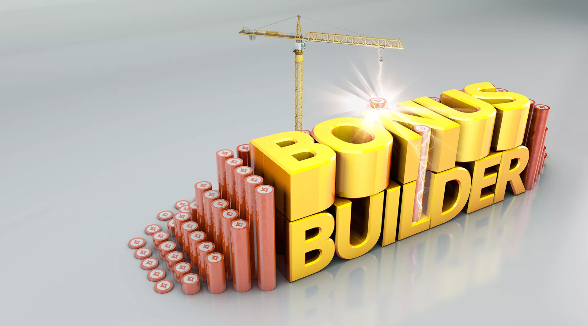
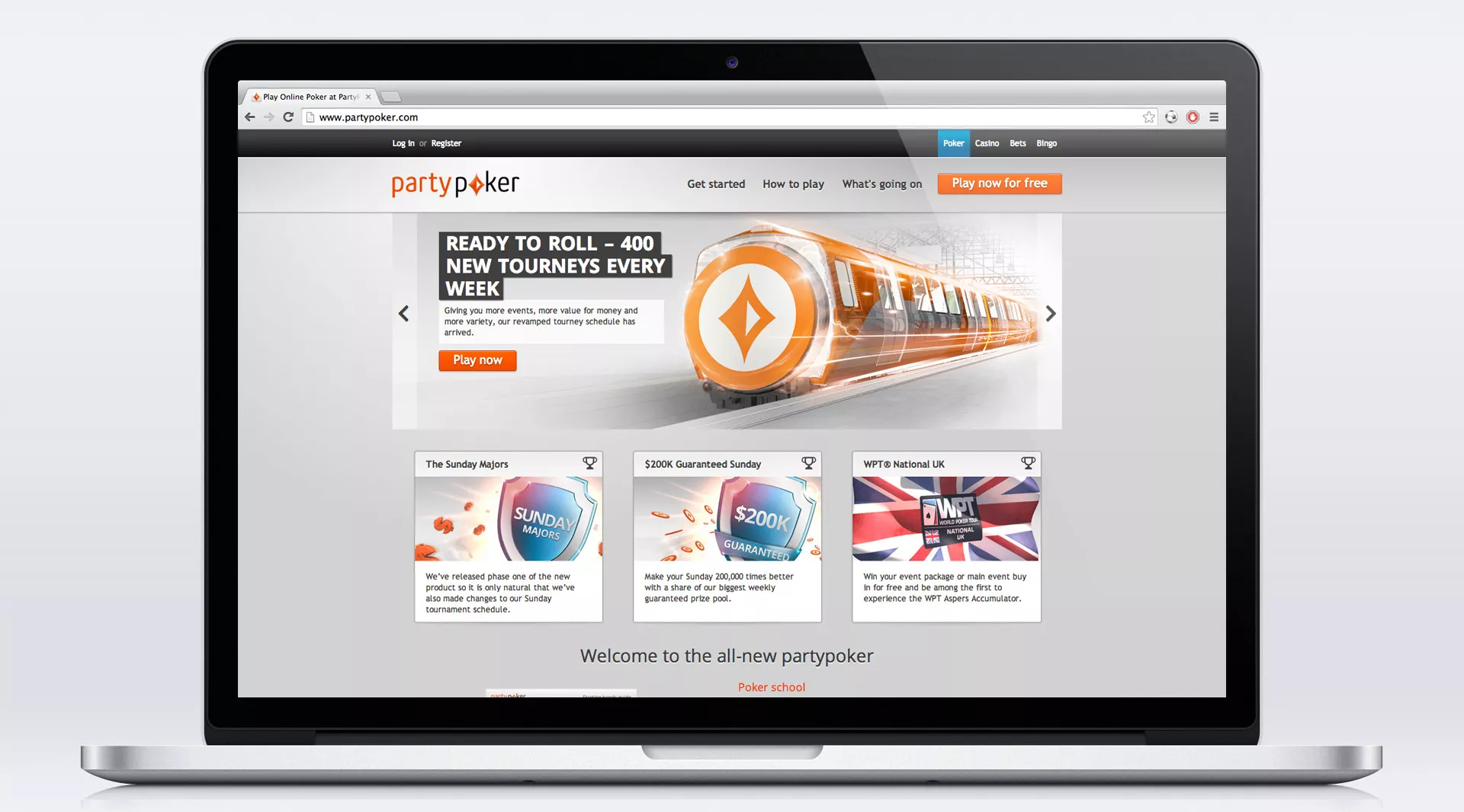
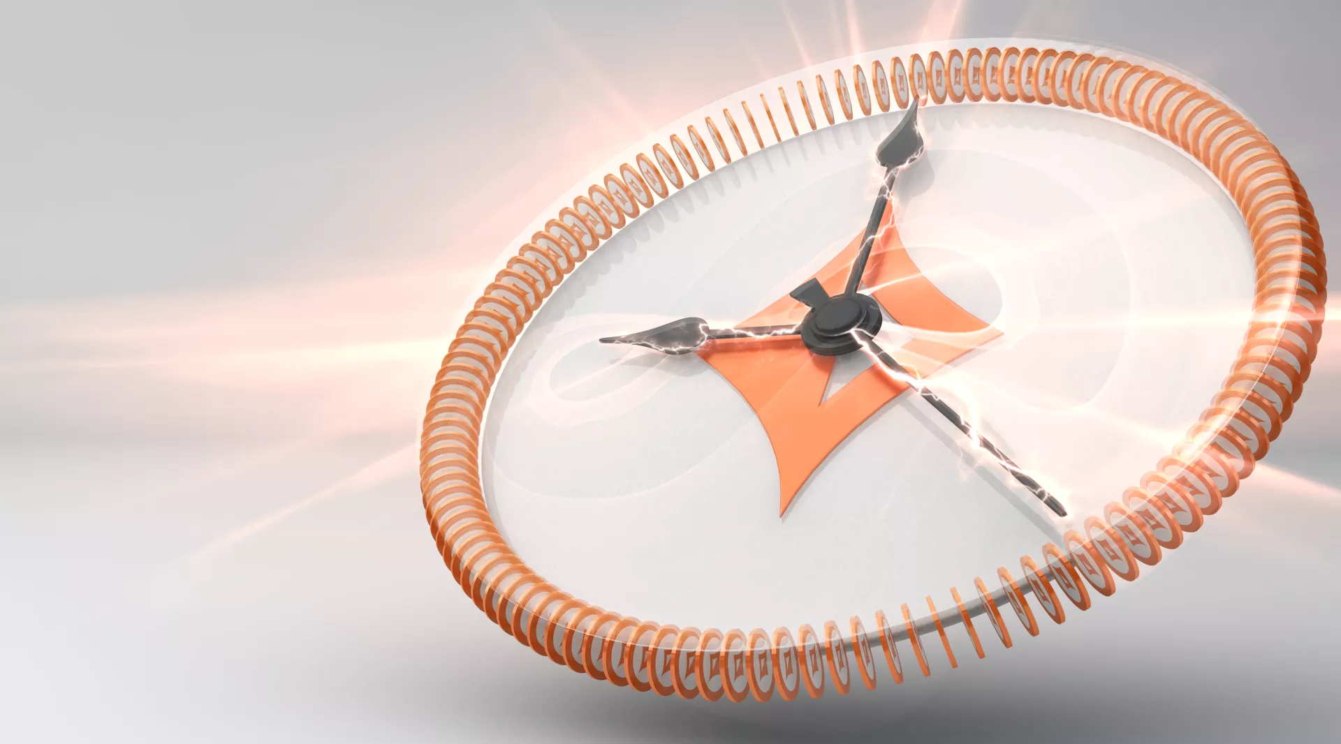
The floor was opened up to the design team to create and define a brand style. Having played an intrumental role in spearheading the creative charge
to set a foundation and define a style for the partypoker marketing output. By incorprating design fundamentals to adhere to, this helped to ensure a level of consistency and quality moving forward.
Furthermore, this supported a new creative style guideline and standard to take forward. With the support of the team, collectively... we experimented and finessed until we achieved the
desired creative solution to push forward.
Over the next 3 years, we would continue to strengthen and evolve the style across many promotions. It was a great pleasure to play such a pivotal
role... 10 years on, the brand style foundation is still intact to this day.


